Page 1 of 2
Battlesuit color scheme
Posted: Tue Sep 01, 2015 5:41 am UTC
by illwieckz
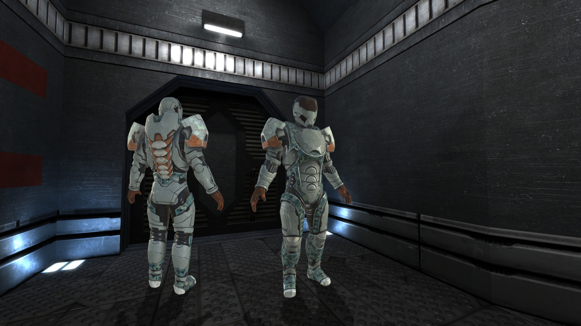
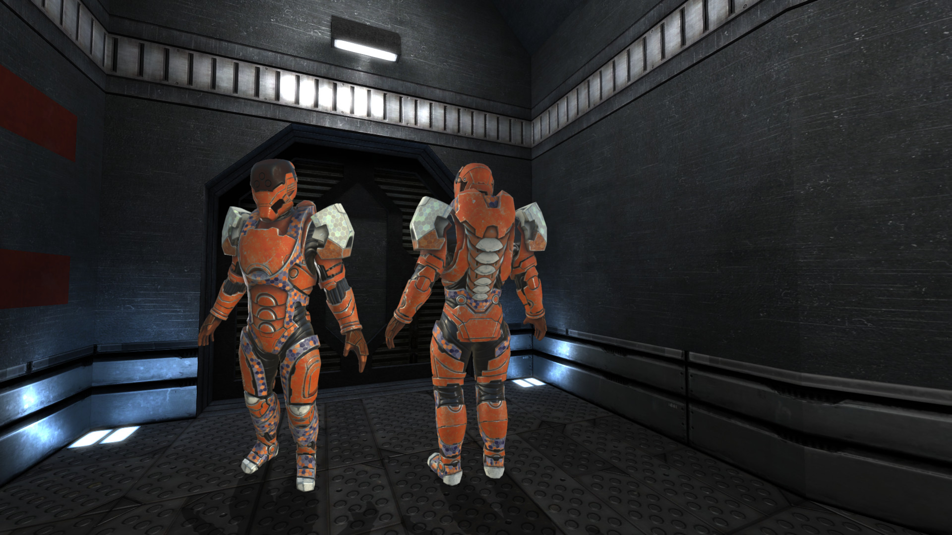
Hey, Stannum have shared two pictures of his WIP battlesuit: [1], [2]. This is WIP, it's just to get some ideas about how it could be.
Seeing these pictures, I've thought I prefer the orange scheme (feel stronger to me, like a bulldozer), but what is your feeling?
I've made some fast-and-dirty copy-pastes over some game screenshot to gives some ideas about how it could feel in-game (these pictures are not in-game pictures, they are collages). The size are probably wrong, the shadows are certainly wrong, there is no ambient color and not colorgrading so it can look out of place, but it can gives you some feeling!
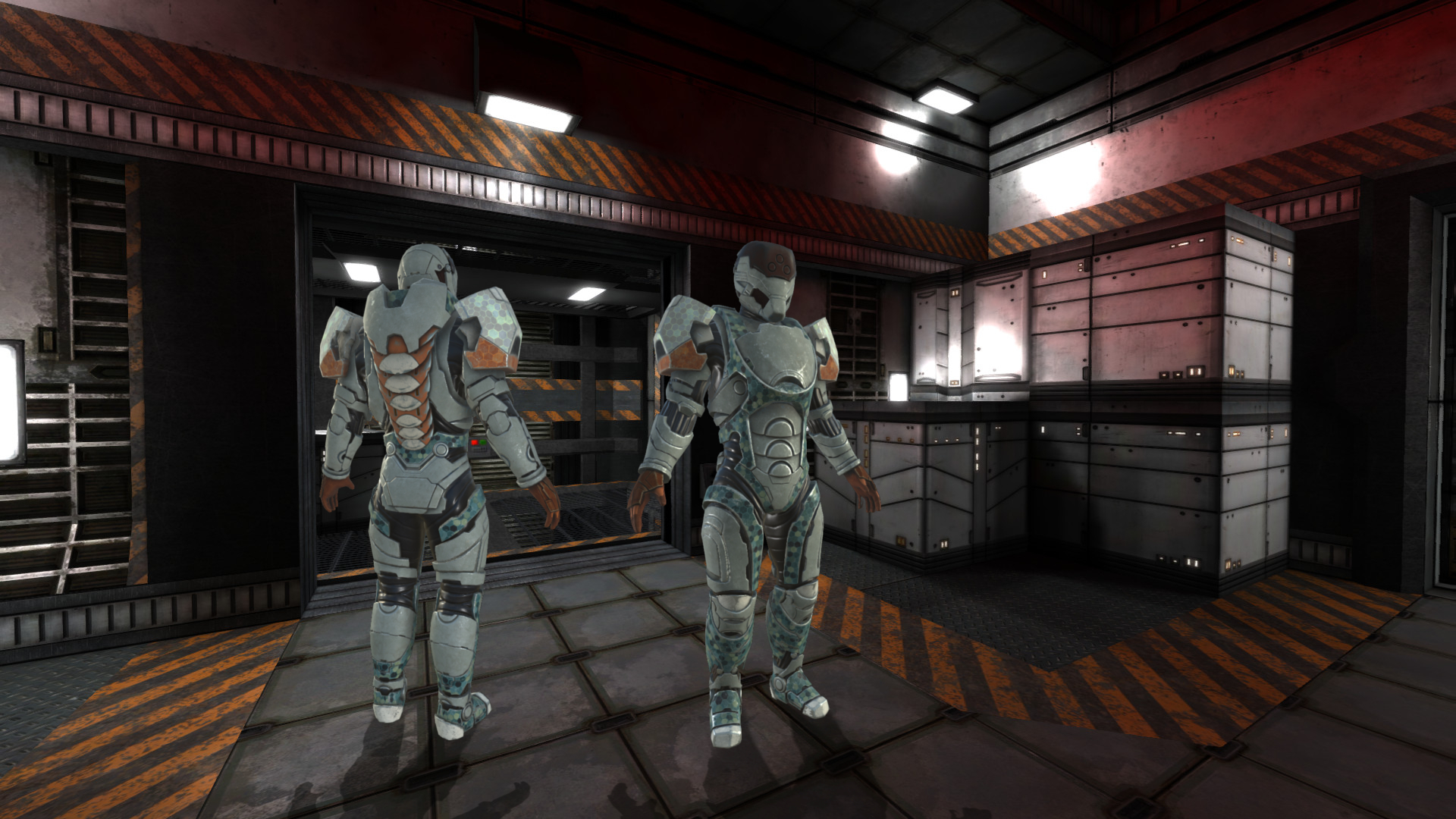
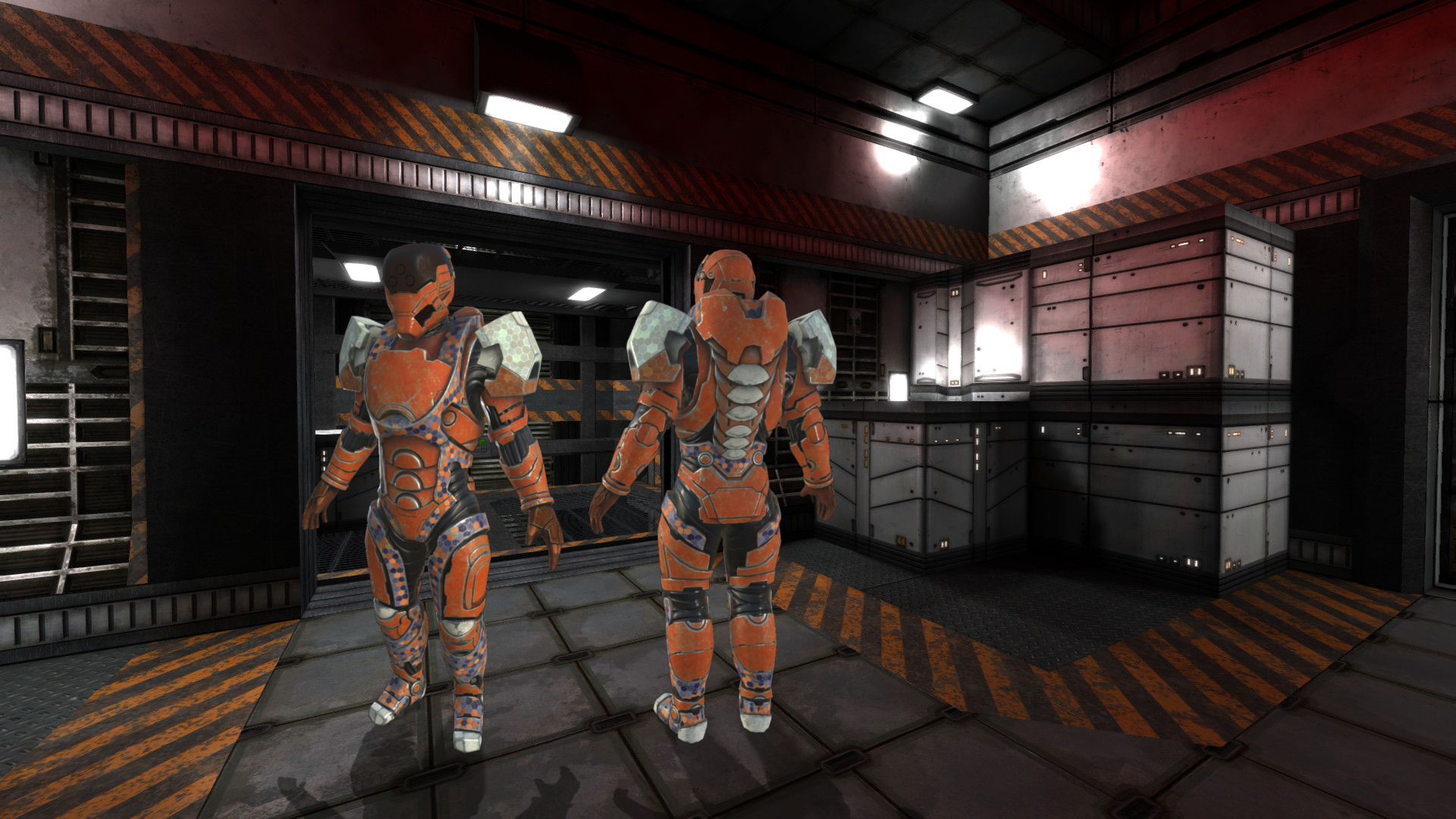
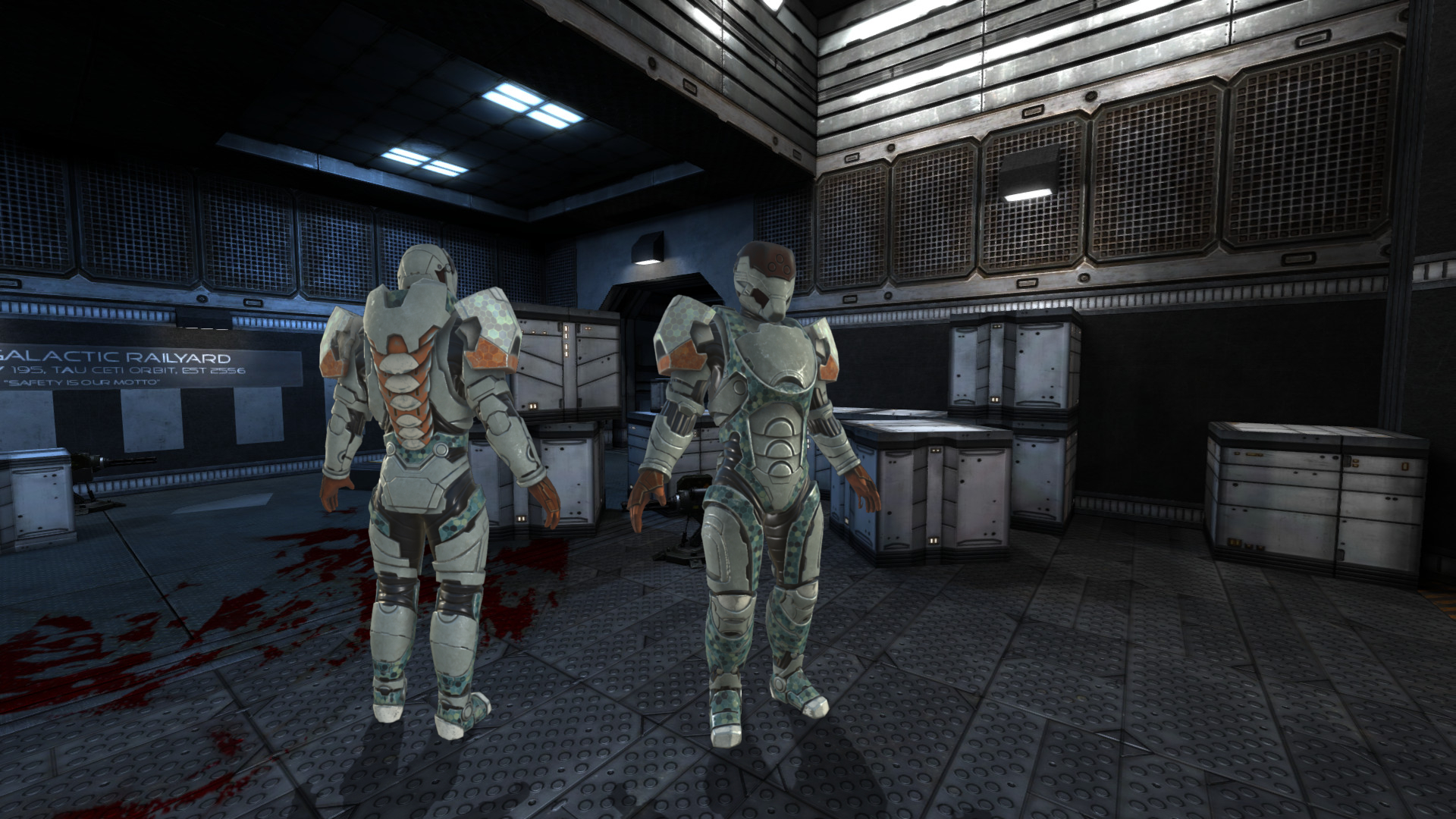
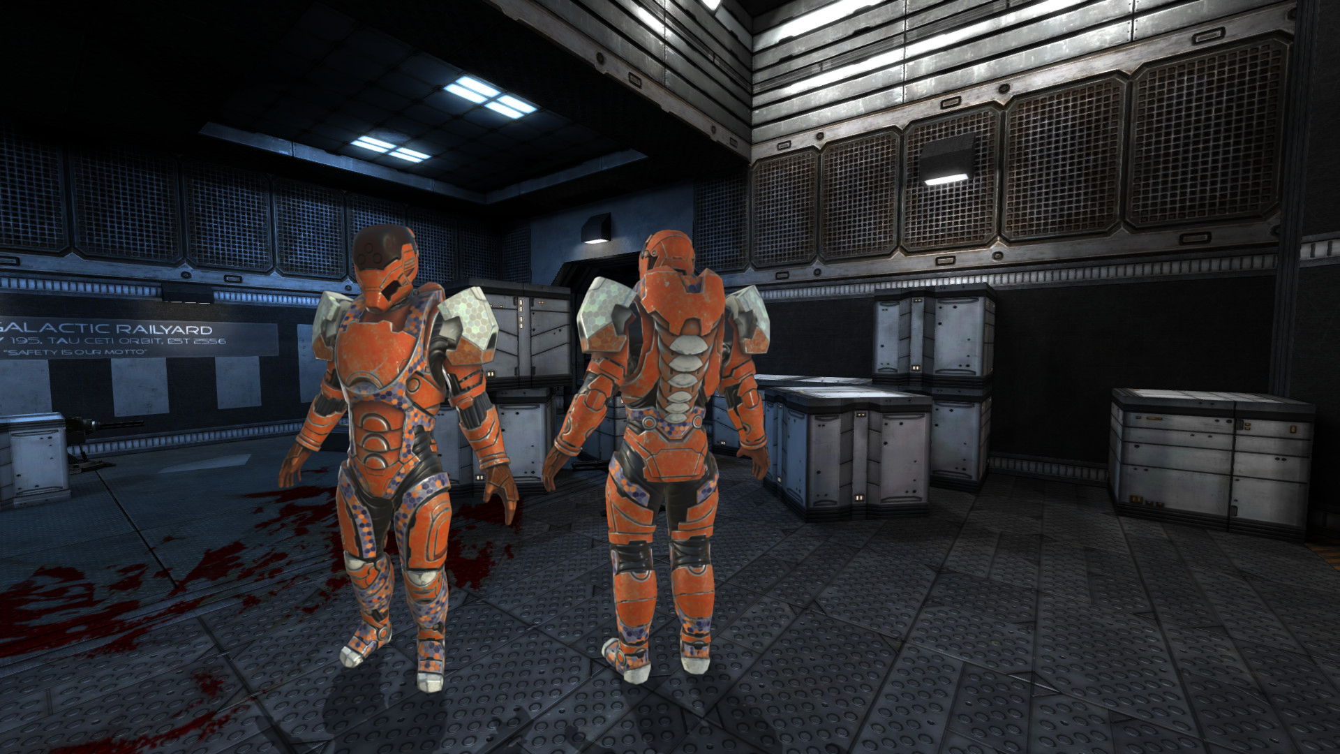
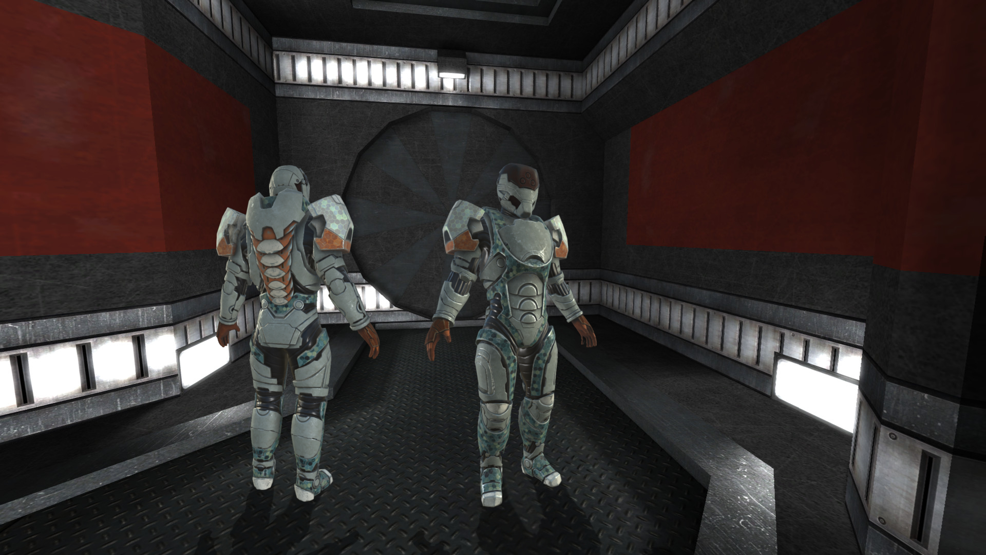
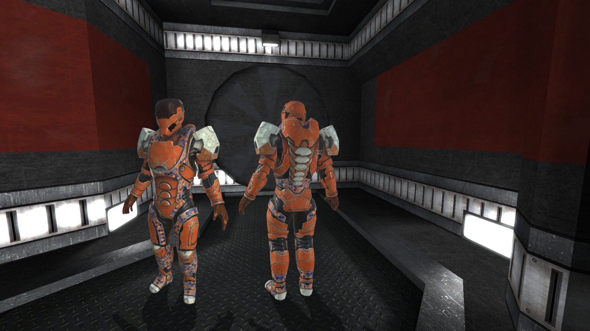
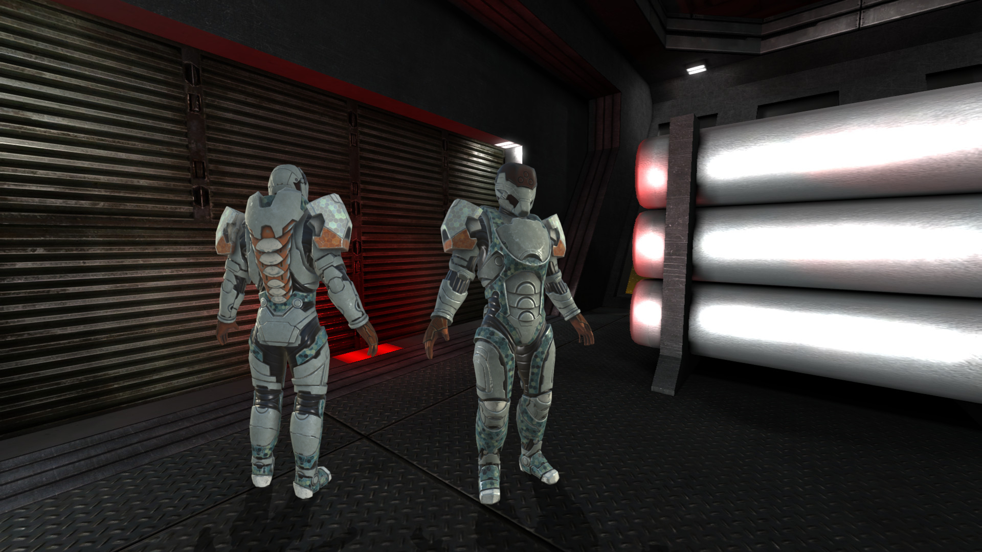
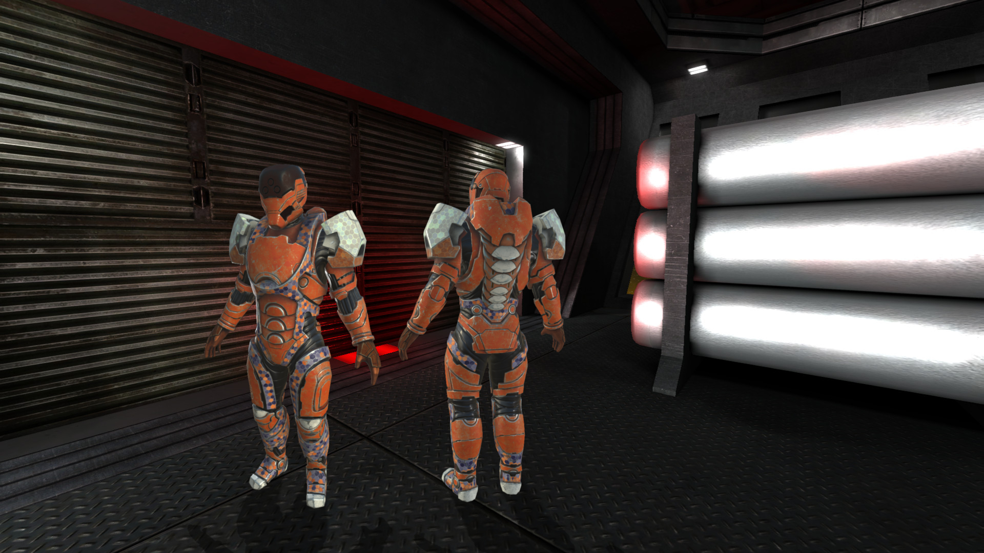
I think the orange one fits better, and you?
Re: Battlesuit color scheme
Posted: Tue Sep 01, 2015 5:42 am UTC
by kharnov
Definitely going to go with orange!
Re: Battlesuit color scheme
Posted: Tue Sep 01, 2015 5:54 am UTC
by Comet_
+1 vote for silver with the orange bits recolored to red as if a medium armor player equipped this monstrous suit over it.
btw looks amazing!
Re: Battlesuit color scheme
Posted: Tue Sep 01, 2015 2:46 pm UTC
by kangz
Re: Battlesuit color scheme
Posted: Tue Sep 01, 2015 3:02 pm UTC
by gavlig
Looks cool except the color scheme on those hex-patterns on his legs. Kinda distracting. And i vote for both skins to be available, they are too good to choose only one.
Re: Battlesuit color scheme
Posted: Tue Sep 01, 2015 6:39 pm UTC
by Comet_
gavlig wrote:Looks cool except the color scheme on those hex-patterns on his legs. Kinda distracting. And i vote for both skins to be available, they are too good to choose only one.
Here, here! 

Re: Battlesuit color scheme
Posted: Tue Sep 01, 2015 9:28 pm UTC
by Tom
Hmm, I prefer the silver one.
Re: Battlesuit color scheme
Posted: Tue Sep 01, 2015 9:41 pm UTC
by krtv`
wow, battlesuit looks amazing!!!
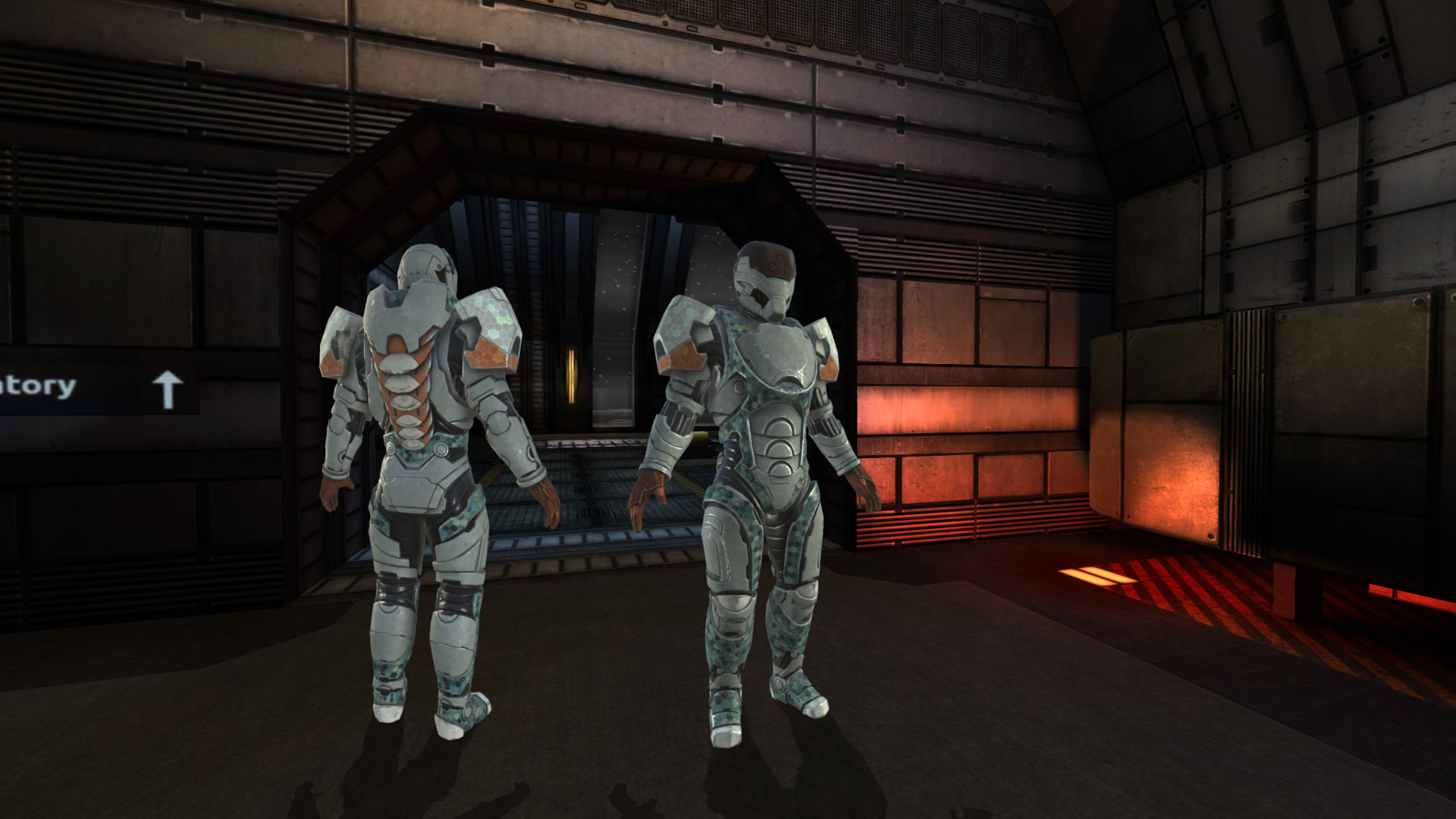
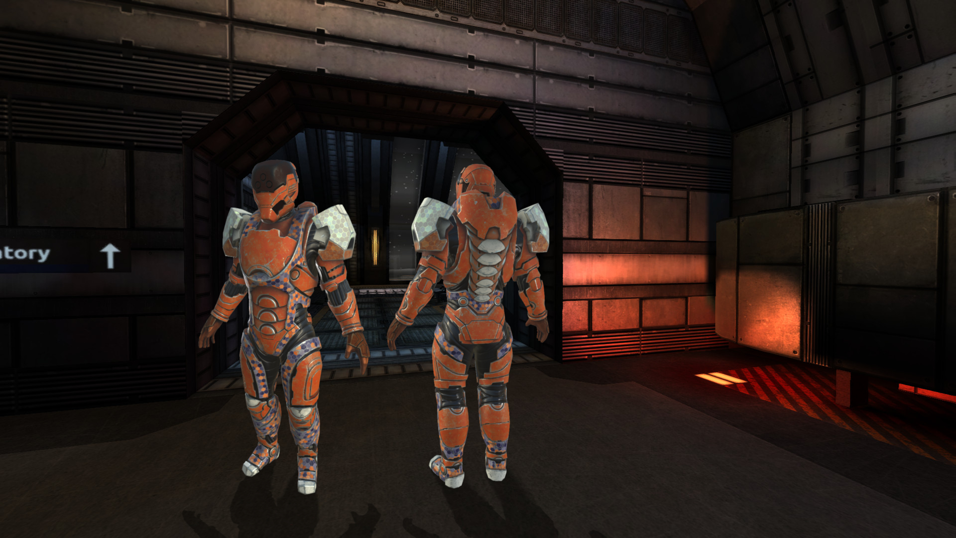
tried to do a quick test to see what it would look like with a darker scheme

Re: Battlesuit color scheme
Posted: Tue Sep 01, 2015 10:50 pm UTC
by illwieckz
Wow, it's awesome!
Except:
also, this may just be me, but i'm not quite sure what it is, but the models, while they look awesome, they don't "contrast" against the map very well, i'm not sure if it's the texture, lighting, animations, all of the above, or what but they look a bit out of place on the maps and "pop out" in the wrong way, almost as if they're not saturated enough, though it's gotten a bit better as the alphas progressed.

If someone wants to try himself, he can just play with my xcf file, just shot a background with a coherent point of view an play with the colors of the model itself. 
Re: Battlesuit color scheme
Posted: Wed Sep 02, 2015 7:30 pm UTC
by krtv`

another quick test, though, after playing around with color options for a while, the problem seems to be the in game lighting/shadowing as well, models don't cast shadows on them selves properly to create the more realistic "blending in" with the environment effect. this may be more due to the fact that the original model was taken from another position of a light source, but i think it's still note worthy.
for example, look at the back of the lower legs, especially the heels, there are no shadows or shading, at all, making it look rather weird, and creating the "pop out" look.
![[1]](http://janvanderweg.com/tremstuff/bsuit/hexasuit8.png)
![[2]](http://janvanderweg.com/tremstuff/bsuit/hexasuit9.png)